MARAU ENGENHARIA
A Brand That Reflects Structure, Precision and
MARAU
In construction, everything begins with a solid foundation and the same applies to a brand’s identity. The challenge for MARAU Engenharia was to transform its technical and operational values into a clear, solid, and recognizable visual language.
We were responsible for developing the brand’s entire visual identity, from concept to detail.
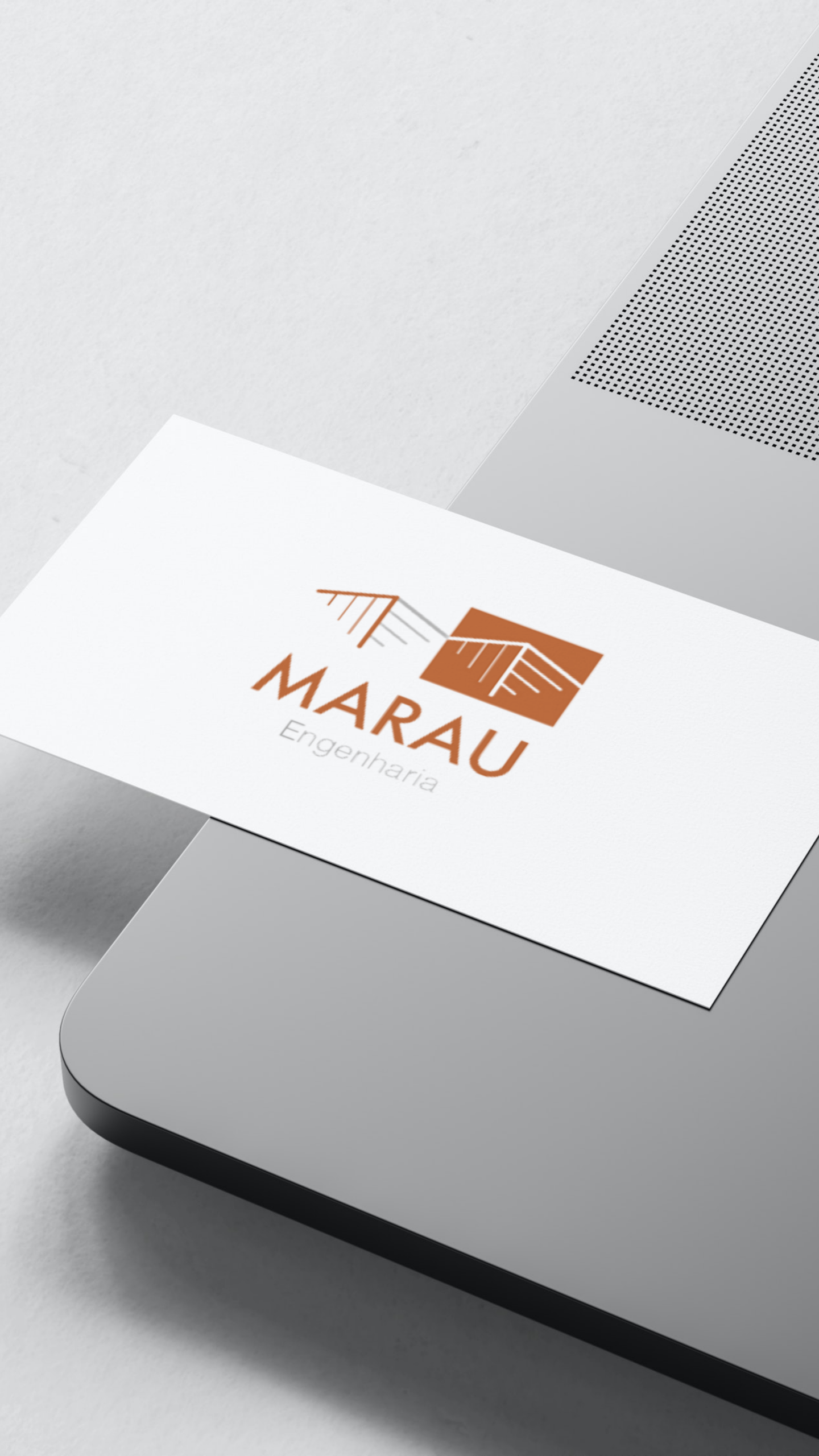
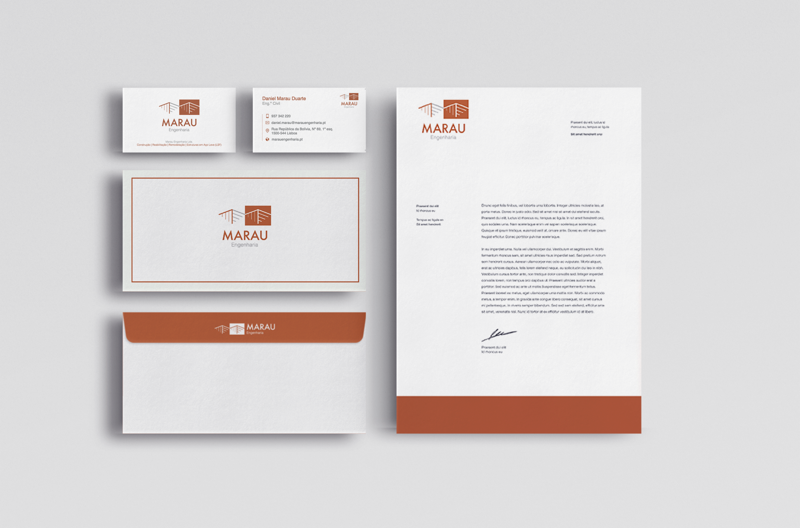
We drew inspiration from architecture and structural engineering to create a logo that represents a construction perspective, with lines that suggest beams, rooftops, and elements under development. This approach references the technical and planned process of civil engineering, conveying a sense of structure, rigour, and trust. The colour palette was carefully chosen to reinforce this identity: the terracotta orange evokes construction materials such as brick and roof tiles, and is associated with energy, stability, and approachability. The light grey, in turn, symbolises lightweight steel, neutrality, technical precision, and sophistication.
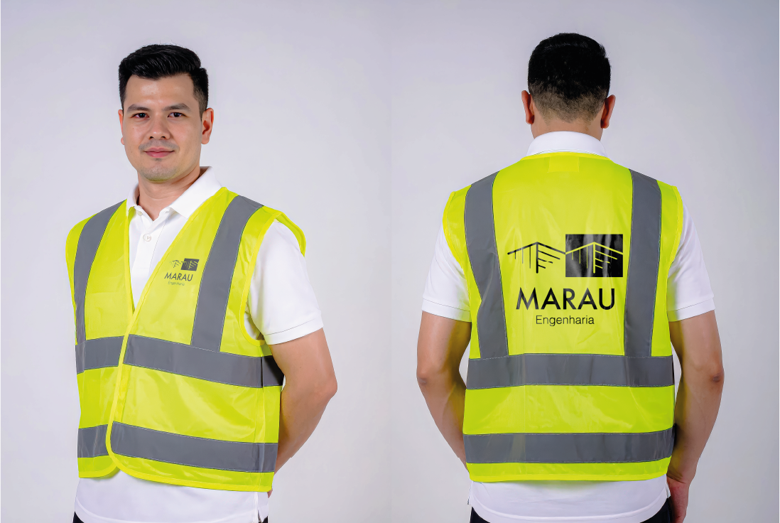
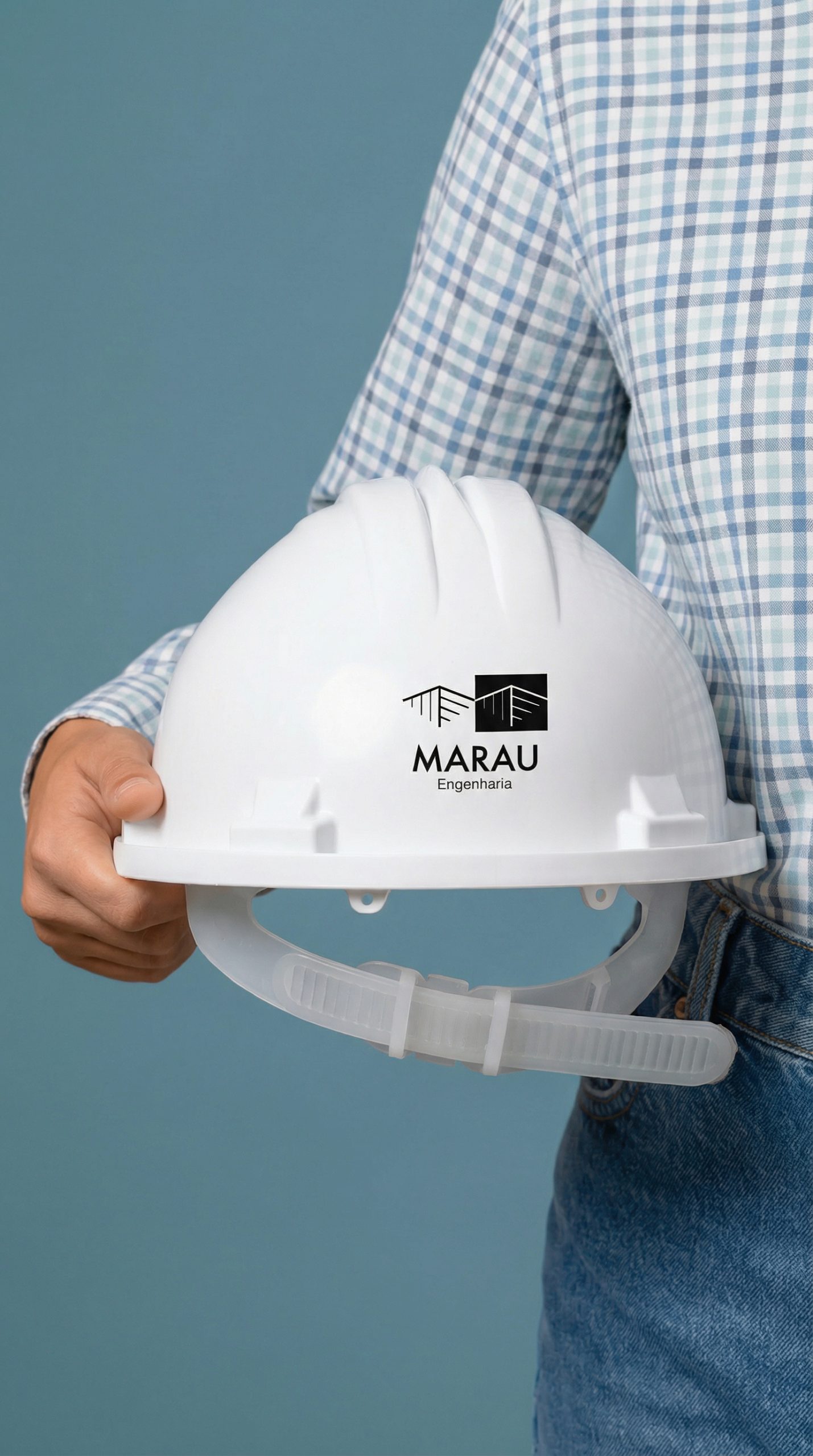
The typography is modern, geometric, and proportional, designed to ensure legibility, professionalism, and visual consistency in any context. The modular composition of the logo allows for versatile applications, adapting to both digital and physical formats, always with clarity and impact.