MUKIIDI
A brand that reflects the
MUKIIDI
MUKIIDI means “energy of truth” in Umbundu.
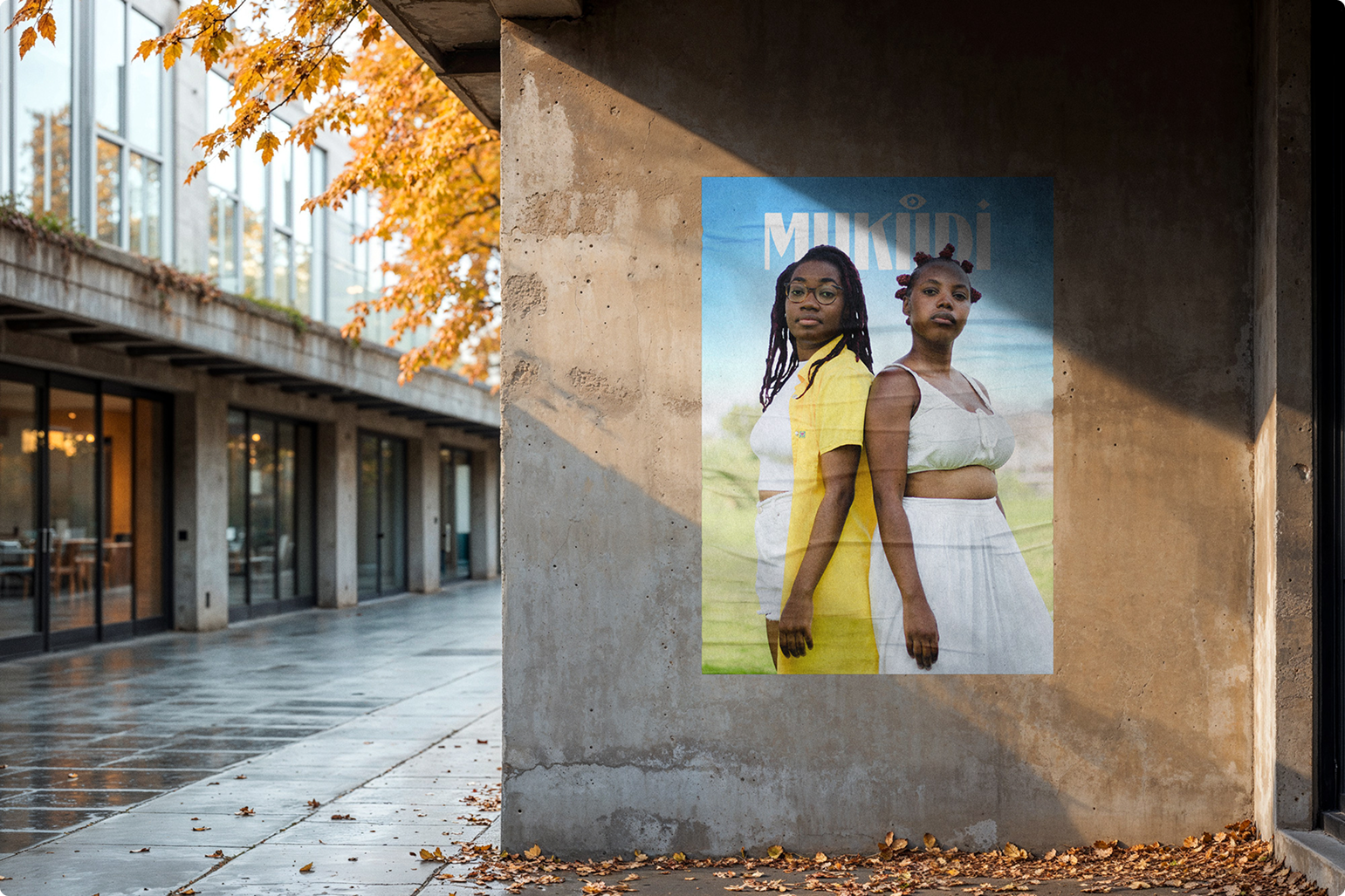
Leia and Sara Ferreira are the sisters who, driven by a desire to understand and transform the world through the power of communication, lead MUKIIDI — a living community, fuelled by videocasts where every topic from the universe of the Portuguese-speaking African diaspora in Europe is deconstructed and discussed openly.
When they came to us to give voice to their idea of community, they brought with them a few clear requirements: that the brand honour their Angolan roots, that it be vibrant, feminine, and convey a strength that is at once powerful and serene.
Our creative journey
The naming was already very strong, so we worked towards building a visual identity capable of translating the values of truth and wisdom.
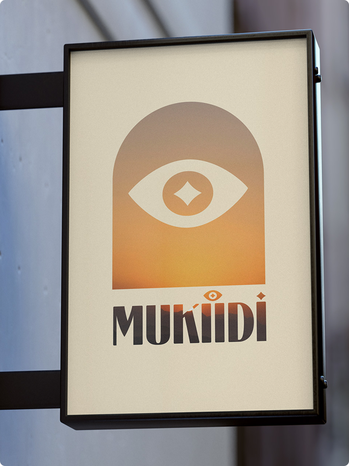
After extensive studies and reference analysis, we arrived at the design of the totem — an ethnographic element that represents the point of balance in collective life, around which conversations, decisions, rituals, and celebrations take place — adorned with the eye, a universal symbol of consciousness and perception.
The colour palette reflects the tones of the African savanna at sunset. The typefaces are stylised versions of the natural forms of one of Angola’s most emblematic trees: the baobab.
Making services:
- Communication Strategy
- Visual identity and graphic guidelines
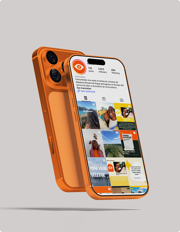
- Pack of 10 launch templates for social media